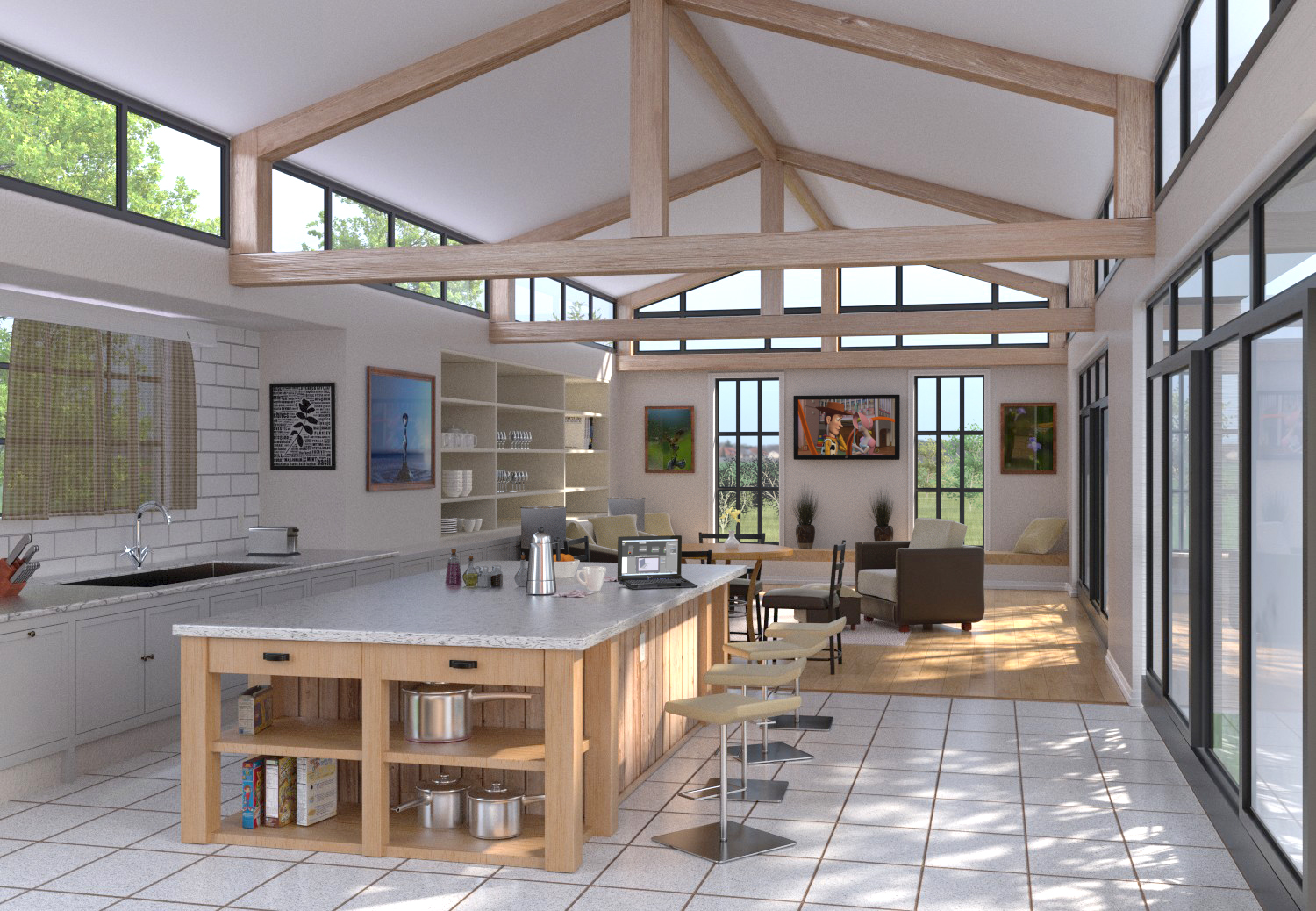
My second real interior render.1500 samples
I use a couple blendswap items, like the pots and salt pepper shakers and the wine glasses. I also use a couple assets from Andrew Prices latest tutorial. Everything else I did.
Some minor PP in photoshop.
Yea… this is fantastic. You’ve created a real cool and welcoming environment. Lots of great detail. The only thing that seems off to me is where the tile meets the hardwood floor. Maybe there should be a threshold or something… because I would end up stubbing my toe on that
Yes, this is cycles. 1500 Samples rendered at Renderstreet and it took about 1.25 hrs.
Also, there is a transition board where the tile meets the wood.
Thanks guys!
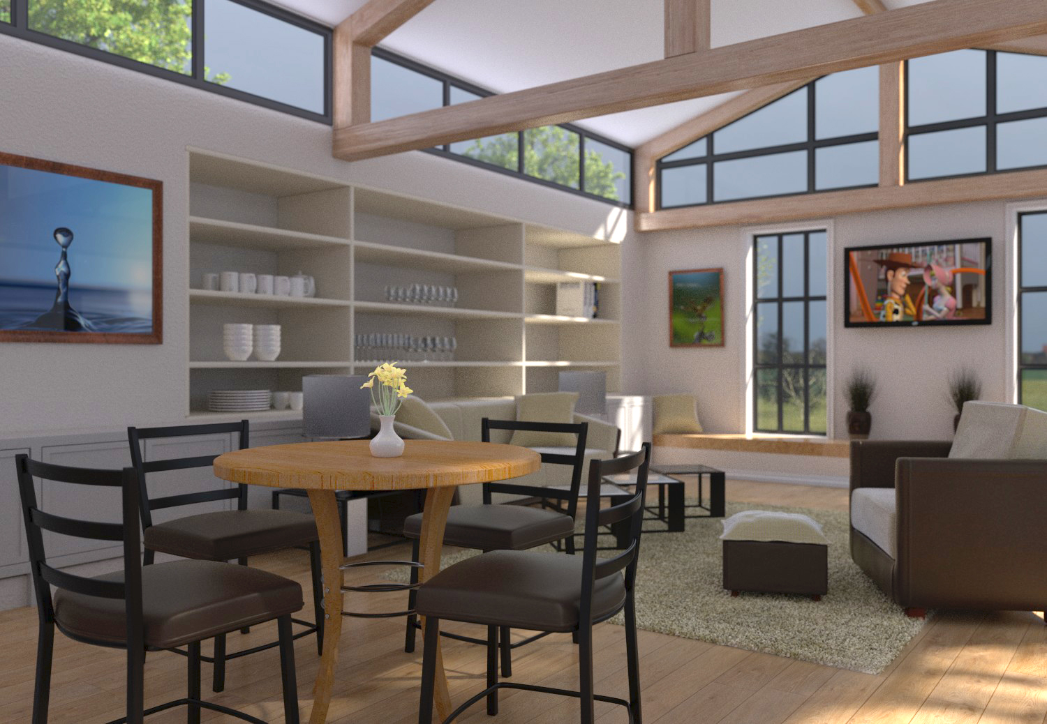
final render of this scene.
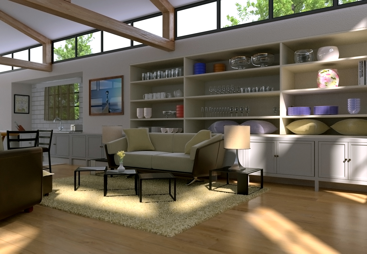
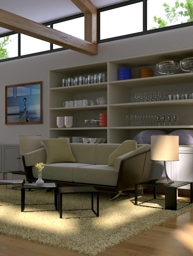
I added some more stuff to the shelves and that has made me realize I should take a couple weeks and just render props if Im going to be doing more of these.
Note to self: Donmake shelves without stuff to fill them…
Nice open space to work with! I would play more with colors, color spots and palette. Try also to catch the attention with less wide lenses (I know…I just watched the last Andrew Price video XD) with different views of the different areas of the room. Something I think is the key for believable archiviz is “imperfection”: nothing in a real house is perfectly alligned like in a CAD drawing. Grab, rotate and move a bit the pieces on the shelves and the furniture themselves.
I’m just pointing this things out because I think they could help you to improove your future archiviz projects.
Keep the good blending going!
Yeah, I definately am still learning. I think I was concentrating so much on filling teh shelves that I didnt pay attention to things being too perfect on them.
I also watched Andrews video. Im very gulty of leaving the camera at the default resolution, although I did change it on this image. Im going to keep his tips in mind on teh next one. I did do a crop of teh last image though.
Fantastic renders. You are right about the shelves being empty. You need to sharpen your shelves decorating skill a bit because for now they look a little bit uninspired. Still. awesome images. Great work.
Thanks guys.
Yeah, Im going to try and keep the shelves to a minimum on my next project. Im certainly no decorating pro, thats what I hire girlfriends for…
I think I have improved the carpet settings since this render. If I use a rug on teh next project, it should look better.
Also, big thanks to the admins for the top row. That was actually a goal of mine for 2013…
Hey, in terms of rendering visualisation, it is great. In terms of archtecture, it is not so believable. Altough, it is possible to have the trusses and columns hidden, while the beams are exposed, as you have shown, it is much more likely to have at least the columns on which the trusses sit exposed as well. Also, in the latest rendering above, there is a shelf, where there should be a column. Same goes for the kitchen area. The sense of wall thickness required to make it seem believable that the shelves and the kitchen are recessed can be achieved by creating depth in the walls, and placing the windows on the outside edge of the thick wall.
Yeah I know. I have been in the construction industry for 25+ years now…I mumbled thse very same thoughts to myself more than once…
The issue is that I didnt plan the gabled ceiling from the start. The wood beams were going to be a decoration on a more standard ceiling height. After my first test render, it ws just kinda boring.
Like I said, many lessons were learned and I will definately plan the whole room more properly next time.
Thanks for the comments!