I’d really appreciate it if anyone could share some tips on how to improve on this rainbow.
Thanks guys,
JDL
Attachments
Rainbow.blend (561 KB)
I’d really appreciate it if anyone could share some tips on how to improve on this rainbow.
Thanks guys,
JDL
Rainbow.blend (561 KB)
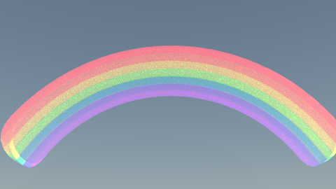
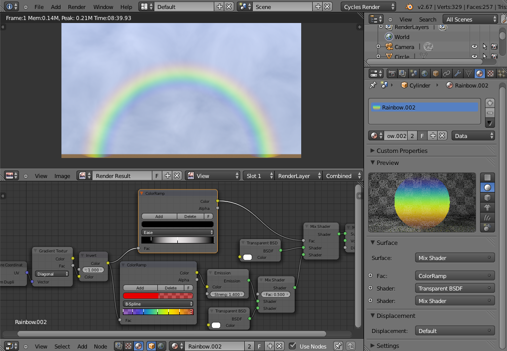
I assumed you meant “more realistic” when you said “to improve”. Here is what I made.
There is still much work to do but that’s an improvement, I think.
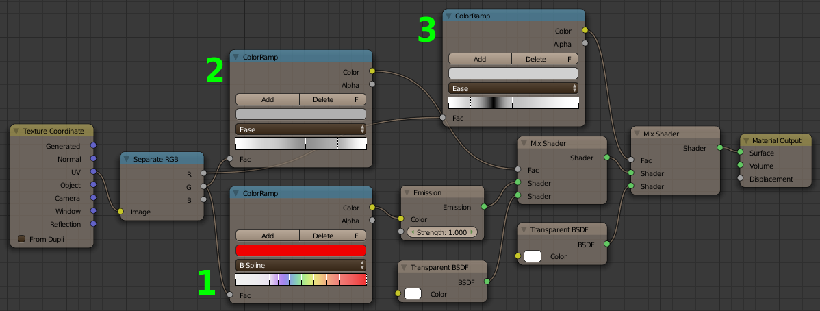
First thing I did was to get rid of the Solidify modifier. Useless. Then I dumped the texture for a color ramp. (#1)
As you can see, I used an Emission shader. Rainbows are made of light! Color ramp #2 adds the transparency to the colors. The black spot in the color ramp #3 determines the position of the highlight along the curve. (Note that the positions are inverted, left/right.)
And if you wonder what I do with the Separate RGB node connected to the UV coordinates, that’s to be able to access X (Red) and Y (Green) separately and use them as factors for the color ramps.
The rest should be straightforward.
The blend file: [ATTACH]237942[/ATTACH]
Enjoy!
The @Kaluura rainbow is awesome. Here you have another material similar to that:
I have used a semi-circle and I have extruded it to create a plain shape. Then I have unwraping it with follow quads option.
The blend is attached in this post.
EDIT: Look in Properties >> Texture Button for mapping texture options of Gradient node.
Rainbow_rev.blend (115 KB)
@Kallura
does you file include your set up ?
interesting way to do it whit emission node
thanks
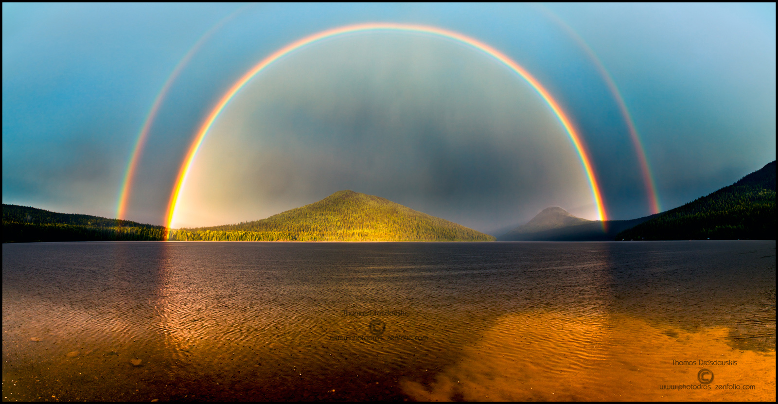
Don’t forget rainbows are always double, with the outer ones colors inverted and fainter (sometimes close to invisible). Inside the inner (regular) rainbow, you also tend to get some kind of halo effect brightening what’s inside/behind it. Ref:
http://andjuniorshakers.com/wp-content/uploads/2010/09/double-rainbow.jpg
http://2.bp.blogspot.com/-I-MJyy7vP-0/TlUk4Iw4PEI/AAAAAAAAAhI/RiVRDUGnx0c/s1600/Bowron-Lake-Rainbow-double-fin-web.jpg (rather extreme halo :p).
If going realism, keep the angles right (approx 41°-42*° for the inner), and the lighting plausible (sun behind photographer), with maybe even weather to match  I like the approach, looks pretty good to me (nice grayscale gradient).
Oops! Sorry I didn’t specify what style I was going for, very important of course 
I want it for a whimsical, cartoonish world (but not 2d), aimed for 3 years old girls (my daughter)  .
.
Nevertheless, learning how to do a realistic one is awesome too! I am still a rookie with the Nodes Setups so this will help big time.
Thank you all for sharing
JDL
:eek:
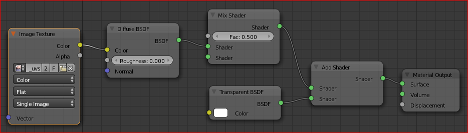
Ok, change emission node by diffuse, and decrease transparent node weights ![]()
nice node setups guys… thanks for the shares…
I have to agree, Kaluura’s setup is quite impressive in that it uses the actual UV coordinate data rather than a texture (and it even fakes some solar reflectance below it as well).
The other setup though looks like it’s more straightforward for those new to Cycles, but it’s clear that Kaluura has truly harnessed the power of math, physical knowledge, and coordinate manipulation.
@Ace Dragon, I agree with you.
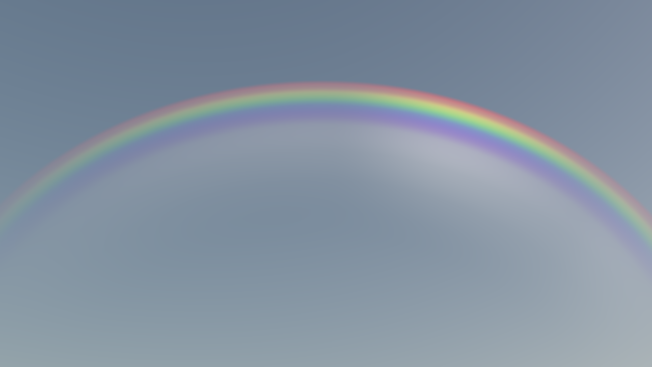
I did a brief tutorial about how to create a rainbow. I added it to a scene I got from blendswap. The result was this:
Thank you kindly for this tutorial EBdlT, very nice of you!
JDL

