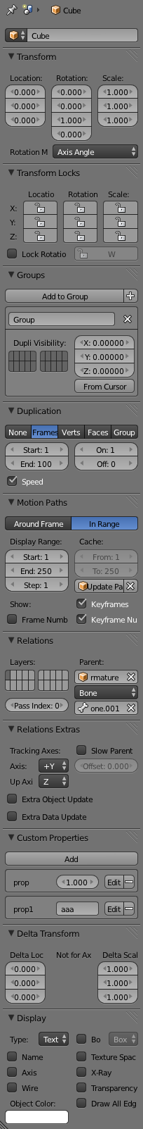
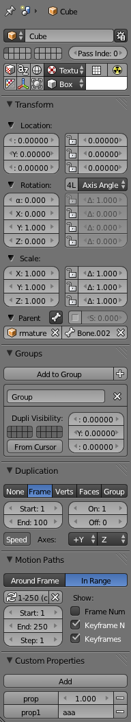
Do you think that Blender’s default Object properties panel wastes space? I do.
I also think that there are too many subpanels and that some settings that logically should be grouped together are located in different sections.
This addon makes Object properties panel more compact and (arguably) more organized. To achieve this, quite a lot of settings are tightly clustered and/or represented as icons. However, learning the new layout should be quite easy - just read the tooltips. Frankly, I’m curious how many Blender users would find it appealing.
On an unrelated note: the addon also contains some UI utilities that might prove to be useful to other developers as well.
Anyway, I’m interested in opinions 
Wiki: http://wiki.blender.org/index.php/Extensions:2.6/Py/Scripts/System/Compact_Object_Panel
(the download link is in the wiki)
For comparison: default layout (left), my proposal (right)
 I re-uploaded the addon (the download link is in the wiki).